

Friday, January 22, 2010
Advertising Fail
Uh, I have no clue what this billboard for Caprica is supposed to be saying.
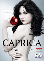 It's almost something that belongs on PhotoshopDisasters, but it's not really the retoucher's fault, it's the art director's fault. I'll admit that I'm commenting without having seen the pilot, but really now. Apart from the over-use of the Eve imagery and the blatant inappropriateness of having a girl who's supposed to be, what, sixteen, posing nude? Granted, the actress is twentysomething, but still. One thing is for sure, Caprica is going to be nothing like it's parent series, Battlestar Galactica. Wheres that was all about the darkness, the fight for life, Caprica is about . . . well, I'm not exactly sure, from the poster. The funny thing is, although I know perfectly well what the series is about, the poster tells nothing. There's none of the high-tech glitzyness that's supposed to define human society at this time evident. I dig the color scheme . . . the brushed chrome and gray are awesome . . . but, what does it have to do with anything? The poor girl looks like a vampire. The contrast is nice, I love the font, but otherwise, this poster is a complete fail. The future of humanity begins with a choice? Sure it does. A choice for horrid art direction!
Subscribe to:
Post Comments (Atom)
No comments:
Post a Comment